Monday, November 19, 2012
RESEARCH: Color Wheel
http://www.sensationalcolor.com/color-theory/color-relationships-primary-secondary-tertiary-hues.html
http://www.colormatters.com/color-and-design/basic-color-theory
Wednesday, November 7, 2012
Monday, September 24, 2012
Today's In-Class Activity
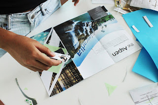
Audrey and I paired up. K joined us in the mid of designing the brochure. Audrey did most of the pastings, and my duty was finding and cutting out related pictures according to the topic chosen. K's job was searching body contents that fit to 1 page of the brochure.
Placement of pictures and information is important.
Audrey.
Me - cutting topic-related pictures.
Good colors and placement.
Cute Brochure by Evelyn and Ashley.
During our presentation, we explained the design of the brochure in terms of colors and method of making it. We decided on the topic high living lifestyle and homes. The color, light green that we chose was based on the mostly-blue images which matches perfectly. It also gives a relaxing feel of the overall look.
We pasted a diamond cutout shape behind the title, so that it looks obvious enough as a title. The background image of the title was cutout this way to give a unique and professional look.
The title and front page of our brochure.
Content inside the brochure.
For the twin towers image, I used my art knife to cut it curve so it wouldn't turn out plain besides, it looks more interesting and pleasing to the eye this way. Which is also because of the influence of Harmony and Rhythm from the curves.
Audrey then cut the top of the bottom image curve that creates radical balance for the whole content design.
The triangles on the page at the right end, I sliced vertical lines divided by my steel ruler ,on a light green paper, then intersecting them by slicing rows of horizontal line to create squares with the same length. I then used my scissors to cut them into half to create a these triangles.
With the placement of triangles, the overall looks seems more attractive with the plain text that K has cut out. These 3 pages gives a unified and balanced design.
We added light green borders on the far right and left for the widespread of the brochure so the brochure looks more 'complete' and professional. The borders gave the whole brochure a neater look too.
For the back of the brochure, we also used large images. The word "Cascadia" was placed perfectly following with the whole image because the folding line as you can see, does not touch the name. The text and the names were somehow placed strategically with the rule of thirds. However, I think our craftsmanship could be better because the text title, "Aspen" has crooked cutout lines.For the twin towers image, I used my art knife to cut it curve so it wouldn't turn out plain besides, it looks more interesting and pleasing to the eye this way. Which is also because of the influence of Harmony and Rhythm from the curves.
Audrey then cut the top of the bottom image curve that creates radical balance for the whole content design.
The triangles on the page at the right end, I sliced vertical lines divided by my steel ruler ,on a light green paper, then intersecting them by slicing rows of horizontal line to create squares with the same length. I then used my scissors to cut them into half to create a these triangles.
With the placement of triangles, the overall looks seems more attractive with the plain text that K has cut out. These 3 pages gives a unified and balanced design.
We added light green borders on the far right and left for the widespread of the brochure so the brochure looks more 'complete' and professional. The borders gave the whole brochure a neater look too.
Widespread of back of brochure.
Audrey, K and I were happy and satisfied with our in-class activity today. We felt a sense of achievement that completed our day.
After our in-class activity, we had tutorials for Assignment 5. I have almost completed my Assignment 5 and pictures and progress will be posted up soon after the presentation. I decided to show my progress of my work through pictures that I have taken ,which I'll also be compiling all of them into a video for Assignment 5 presentation tmrw.
I hope everything goes smoothly tmrw :)
Subscribe to:
Comments (Atom)


