Grids are important when it comes to designing. It helps you enhance your work's composition and attract targeted audience. What we learned in class today was, grids also applied on magazines and newspapers making it easier for the reader to read.With a strategic placement of pictures and articles on a page, it can successfully attract audiences because of it's aestheticism as well, thanks to the help of grids.
What's more important is, we also learned how grids work and getting to know the names of each components in a whole grid format.
Firstly, our whole class was told to bring 12 cutout pages of magazines/newspapers. I had 12 cutout pages from a magazines prepared. Then as usual, the slides and explanations comes in. I regretted not bringing my camera to class yesterday :(
The slides that were shown yesterday are: (taken from my lecturer, Ms Lisa's blog,
http://taylorspod.blogspot.com)


"Anatomy of a Grid
Grids
act as guides for the placement of elements in a design. No matter how
simple or complex, grids share some common parts, each fulfilling a
specific function. Not every one of these parts needs to be present in
every grid.
A little further down the page I’ve added an image showing these
common grid parts, which you hopefully find helpful as you read through
their descriptions below.
Format
The format is the area in which the design sits. In a book or
magazine the format is the page. On a website the format is the browser
window.
The format defines the live area of a design where type, images, and other media are present.
Margins
Margins are the negative space between the edge of the format and the outer edge of the content.
The proportions of margin help to establish the overall tension (or
lack of tension) in a composition. The smaller the margin the more
tension is created.
Larger margins create more whitespace
and help focus attention on the positive space of the design. Larger
margins also help the eye find a place to rest and can be a good area to
place subordinate information.
Flowlines
Flowlines are horizontal lines that break the space into horizontal
bands. They can be used to help guide the eye across the page and can be
used to impose starting and stopping points for text and images to be
aligned.
When elements are aligned to the top of a flowline it’s called a hangline as the elements appear to hang from the line.
Type is often aligned to a series of flowlines equally spaced down the page called baselines. The base of the type sits on the line, hence the term. Aligning type to a baseline can help establish a vertical rhythm in a design.
Modules
Modules are individual units of space that are separated by regular
intervals. Modules are the basic building blocks of grids. When repeated
they create columns and rows.
Ideally the width of a module will be based on the measure of a line
of text. The height would be based on some multiple of the type’s
leading or line-height.
The upper left corner of a module is considered to be the active corner and the lower right corner, the passive corner.
Spatial Zones
Spatial zones are fields of adjacent modules. Each field can be assigned a specific function within the design.
A long horizontal field might be used to place long horizontal
images. A long vertical field might be used for long blocks of text. A
large rectangular field might be used for video.
Design elements will often be placed inside a field or spatial zone as opposed to a single module.

Columns
Columns are vertical bands of modules. There can be any number of
columns in a grid. More columns leads to more flexibility, but can also
make the grid difficult to work with.
Column widths can be equal or they can vary across a grid.
Rows
Rows are the horizontal equivalent of columns. Online it’s harder to
plan for rows as the height of the format is often inconsistent and
dynamic.
On some pages your design may call for a fixed height, though on most
pages your design is allowed grow vertically with the content.
Gutters
Gutters are the spaces separating modules either vertically or
horizontally. Typically we think of gutters as the space between
columns, but they are also the space between rows.
The minimum width or height of gutters should be an ‘em’ though this
should usually be larger to better separate columns from columns and
rows from and rows. The height of horizontal gutters should be based on
the leading or line-height of the type.
Folio
Folios are created when page numbers are placed consistently in the margin, usually above or below the composition.
Running Header or Footer
A running header is a guide at the top to indicate your position in a
manuscript. You’d find information like title, chapter title, section
title, author, etc located here. A running footer is then this
information is placed at the bottom of the format.
Markers
Markers are placement indicators for subordinate or consistently
appearing information. Markers can be used to denote the location of
folios, page numbers, etc.
These last 3 are more commonly found as described in print, but there’s no reason they couldn’t also be used on a website.
For example blog posts aren’t usually given page numbers, but they
often display the publication date. When present the date is usually
shown at the top of the post, but there’s no reason it couldn’t be
included in a running header or as a substitute for the page numbers of a
folio.
Summary
As more and more web designers are looking to employ grids on the sites they design it makes sense for us to learn the language of grids in order to better understand them and to better talk to each other about them.
When many people talk about grids online there’s often a focus on
columns and to a lesser extent baselines. There are more parts to grids
though than columns and baselines.
Hopefully the diagram above along with the definitions in this post
will give you a foundation for the common language of grids to help you
further understand explore using grids in your own work."
source: http://www.vanseodesign.com/web-design/grid-anatomy/
 More examples:
Rule of thirds


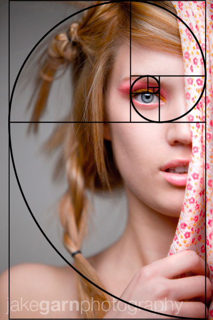
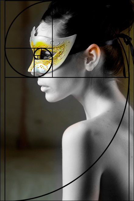
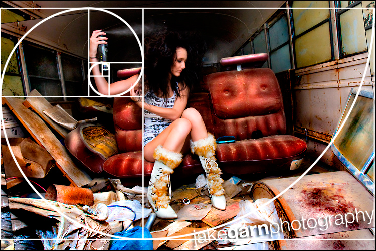
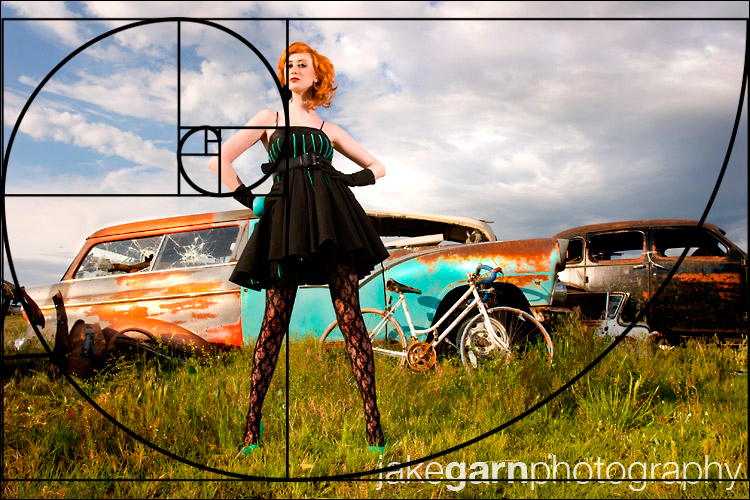
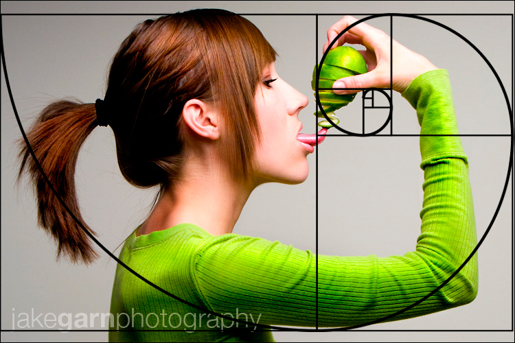
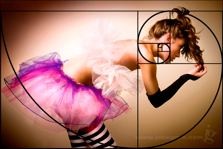
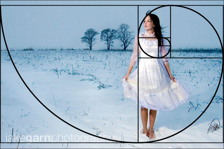
During my research for the rule of thirds recently I also discovered the golden mean -
"The Golden Mean
Why does the photography rule of thirds work? Some people believe that it’s because it’s a rough approximation of the Golden Mean (also known as the Golden Ratio or Divine Ratio).
The Golden Mean defines a spiral pattern that shows up repeatedly in
Nature, in everything from a nautilus sea shell to a sunflower, to the
spiral form of the galaxy itself; it occurs in more natural subjects
than you could imagine, making it no coincidence. Since there’s
obviously something special in Nature about this form, it makes sense
that humans would be naturally attracted to it – after all we’re part
of nature too!
The Math Behind the Golden Mean
You definitely don't need to know this to take good
pictures!! But for those who are "geeks" (like me :-) who want to know,
here's the math behind it.
The Golden Mean is defined by a mathematical sequence of numbers known as the
Fibonacci sequence.
By definition, the first two Fibonacci numbers are 0 and 1, and each
remaining number is the sum of the previous two. So the sequence is:
1, 1, 2, 3, 5, 8, 13, 21, 34, 55, 89, ....
The ratio of each pair of consecutive numbers approximates
phi, or the number 1.618. (
5 divided by
3
is 1.666, 8 divided by 5 is 1.60...) By the 40th number in the series,
the ratio has stabilized at 1.618, accurate to 15 decimal places.
Now, where does the spiral come from? We draw a rectangle
that is divided into squares as in the picture below. The ratio of the
length of the side of a larger square to the next smaller square is
the golden ratio of 1.618:1.
A Fibonacci spiral is formed by connecting the arcs (quarter circles) joining opposite corners of the squares.
 The Fibonacci spiral.
image source: wikipedia.org
And voila! A Fibonacci spiral!
The Golden Mean and the photography Rule of Thirds don’t quite line up, but they’re close. So you can avoid taxing your brain with all that math, and take the lazy route! Just follow the rule of thirds ;-).
 The Fibonacci spiral in black, and the rule of thirds in pink. Close!
 The Fibonacci spiral in action.
© Julie Waterhouse Photography
Now, don't get too hung up on following this spiral pattern
in your compositions. The rule of thirds is a good approximation, and
over time you will develop an instinct for what works. You will find
that you naturally gravitate to this pattern for some of your
compositions without going hunting for spirals! And do note that I said
"some!" Not all compositions should or will follow this pattern."